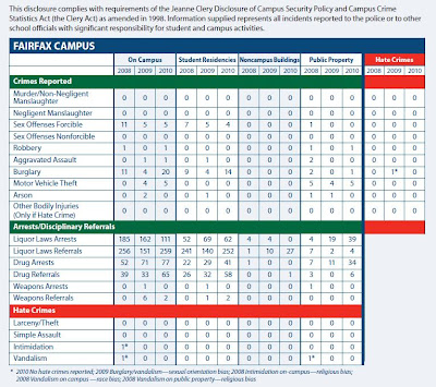
A few days ago I was emailed a pdf document: the
2011 Annual Security Report for George Mason University. As mandated by the Jeanne Clery Disclosure of Campus Security Policy and Campus Crime Statistics Act (yeah I hadn't heard of it before either) it provides a breakdown of all criminal activity which occurred on campus, by year, and with special columns for "Hate Crimes." The picture I attached has the numbers for Fairfax. This is the most interesting part of the document to me because it contains some raw figures on different offenses committed in the campus I attend. Statistics for the other George Mason campuses (Arlington, Prince William, Loudoun, etc.) are also available but are a lot less edifying, because the columns have just a bunch of zeroes. Coincidentally, Fairfax also happens to be the only campus with attached undergraduate housing -- make of it what you will.
 |
| The most exciting table I've seen since breakfast. |
This report is obviously intended to increase public awareness about crime rates on campus, allowing potential students and their parents to make an informed decision when comparing different universities.
What I wonder is, how does someone look at this report and get any sense of the probability that they themselves will be victimized? This blog post is a rough attempt at answering that question.
Some useful figures to get started with:
